This is how easily visual data can mislead
Data visualization can be powerful. But with great power comes great responsibility.
After the Supreme Court decision declaring bans on gay marriage unconstitutional, Bloomberg Business dusted off a pretty example of visual data journalism.
Which sucks.
Data journalism done well is powerful. Intelligent visual display of that data often can tell a story better than plain words. As with any form of journalism, though, decisions about what to leave in and leave out can result in deception, not education.
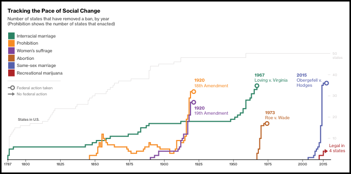
To understand why that happened with Bloomberg’s graphic, start with the headline (“This Is How Fast America Changes Its Mind”) and some of the intro:
Social change in the U.S. appears to follow a pattern: A few pioneer states get out front before the others, and then a key event—often a court decision or a grassroots campaign reaching maturity—triggers a rush of state activity that ultimately leads to a change in federal law.
These words posit a strong thesis: All American social change involves slow change at the state level, followed by a sudden rush of state changes, followed by a change in federal law. This process is evidence of a changing of the American mind, which (I’m presuming here) means a change in public opinion.
To illustrate the evidence for this thesis, Bloomberg shows selected changes in state law regarding six topics: interracial marriage, Prohibition, women’s suffrage, abortion, same-sex marriage and recreational marijuana. All six are displayed on a single timeline, as well as broken out individually with short explanations.
Here’s what’s wrong:
1. The data don’t illustrate what the headline claims. Only two endpoints are constitutional amendments; the rest are Supreme Court rulings. The Court’s rulings are, as we’ve been reminded often, the decisions of nine unelected people. Ask Bobby Jindal (“lets (sic) just get rid of the court“) or Franklin Roosevelt (no, let’s expand it) whether they agree that a Supreme Court ruling is evidence of the changing of the American mind.
Similarly, the data for gay marriage mix change made by state voters or legislators with changes ordered by federal courts. Do federal court rulings constitute “a rush of state activity”?
2. It does not include counterexamples of changes at the federal level that were not preceded by a rush of change in the same direction among the states. Consider Supreme Court rulings such as Dred Scott or Brown v Board of Education, or the Civil Rights Act of 1964.
3. It does not include counterexamples of movement at the state level that led to federal changes only much later, if ever. It took years, even decades, after anti-contraception laws had been all but eliminated at the state level before the Supreme Court ruled them unconstitutional in Griswold v Connecticut.
4. It oversimplifies. Visually, the paths to Prohibition, women’s suffrage and abortion rights are lumped together as proof of the thesis. In the text below, the up-and-down history of temperance and the pre-emption of state action by Roe v Wade get only slight mention. The tangled relationship of temperance, suffrage, anti-immigrant bias and World War I, however, make it impossible to draw clear parallels between the events of 1920 and those of today. Even the path to Roe v Wade was much more complex than the chart suggests.
5. It uses arbitrary cutoffs to ignore inconvenient evidence. How does the end of Prohibition in 1933 tie in with the chart’s logic? How do the increasing number of state restrictions on abortion — even as polling suggests public opinion has changed, if at all, in the direction of more support for abortion rights — mark Roe v Wade as a turning point?
6. It includes one example — recreational marijuana — that the text says is “very much in its infancy” — but it’s put on the same timeline as the others, giving it a visual importance.
These are classic examples of the risks in visual data journalism:
- Incomplete data. This can be a result of difficulty in obtaining a complete dataset, or it can be the result of deliberately choosing an incomplete set. Often, this happens because the reporter starts with a thesis and then selects data that support it; the data should come first.
- Misleading categories. Data points don’t always fit neatly and automatically into distinct categories. Deciding which set each point fits is an editorial decision. Those decisions should be based on rational rules and be clearly indicated, not buried.
- Oversimplification. Complicating factors make for confusing charts and weaker conclusions. Journalism is not judged first based on its simplicity, however, but on its accuracy.
- Conflict between visual and verbal presentation. No amount of footnotes, introductory or following text can make up for the apparent implications of a visual display. The guiding principle of the visual display of quantitative information is not whether that display is attractive, but whether it — on its own — accurately and clearly communicates the facts.
The distressing thing about a chart like this is that I’ve seen it praised and passed along by educators and experts. Even those who know better can overlook flaws if a chart claims to demonstrate a trend they already think to be true, or a theory that sounds sensible. If that can happen to experts, imagine what the impact of such charts is on the public.